I love browsing online, sometimes I think I’m addicted to it, *flashback – it was the time when there was no internet and I was getting buzzed with channels from cable TV, ahhh those were the days. *Back to the present, as a web designer I spend a lot of time online to search for tutorials, new tech trends, resources and inspirations that could help me with my work especially during those “creative block” moments and I’m amazed with the out-pour of great talents I find out there. The instability and insatiability to be creative is overwhelming. Coming up with fresh and original designs has been the *trend that has been building up and will continue to shape the way we see web designs long after the Web 2.0 mentality fades into the background, in retrospect there was a time when I thought that there was something wrong with me because as soon as I’m done with a website design I’m already on my way to redesigning it, it was a great relief when I found that I’m not alone and this urge to re-design constantly is actually a process that will bring out the best in us.
Here is a compilation of websites and their designers that I have been following on a regular basis not just for the content but also to be inspired by their style and the story behind their designs, some of them had numerous re-designs since I found them that it wouldn’t surprise me if the following featured sites has a new lay out by the time you get through this post. What I liked about this collection is the genius behind their concepts, a strong relationship between the design and the designer or the design and how it represents the site itself. Enjoy.
Cultural identity is the identity of a group or culture, or of an individual as far as one is influenced by one’s belonging to a group or culture. — wikipedia.com
Cultural Background
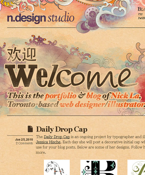
N.design studio
The Design
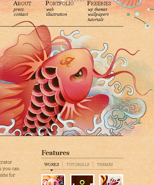
The main page is accented by a beautiful illustration of a “Koi fish – an ornamental domesticated variety of the common carp (Cyprinus carpio) that are kept for decorative purposes in outdoor ponds and water gardens. They are also called Japanese carp. – wikipedia.com”
A water color inspired artwork with an Asian flair and uses textures for effect that creates an aged and mystical feel. As you navigate to the different pages you will discover that each one is headlined and adorned by different elements that are common in our natural environment i.e. Plants – Bamboo, Lilies… Animals – Fish, Stork… A true Zen experience on every page.
The Designer
Nick La – was born in Vietnam currently based in Toronto, Canada. He is one awesome illustrator and web designer whose focus are designing stock icons, illustrations, and beautiful CSS websites. Nick also created and maintains popular blog sites:
- Web Designer Wall – a resource and tutorial website
- Design Jobs on the Wall – a classified ads site for web designers, developers and potential employers
- IconDock – an iCon e-commercial web source
- Best Web Gallery – a gallery of high quality web designs where your site can be featured and get the traffic you have always been craving for.
INDOfolio
The Design
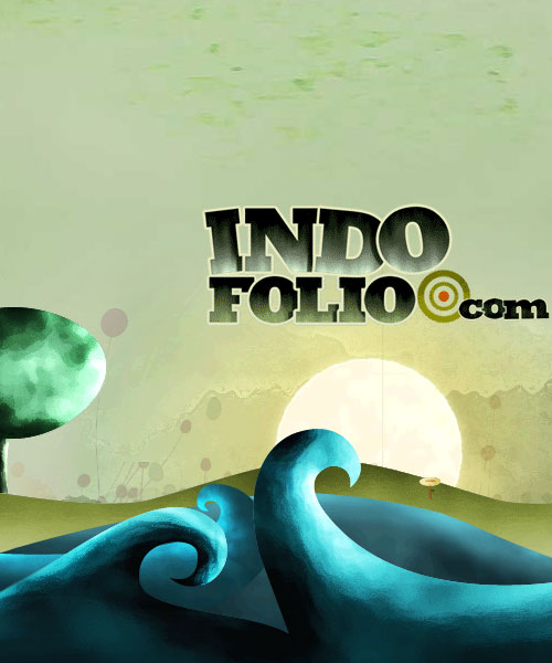
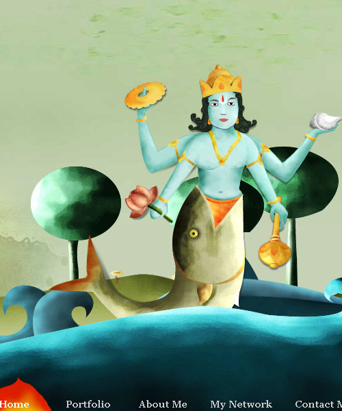
Inspired by Russian art of realism that features landscapes of wide rivers, forests combined with a pure Indian creative identity, this site features some of the reincarnations of “Vishnu – the Supreme God in the Vaishnavite tradition of Hinduism. – wikipedia.com” each page has it’s own avatar representation.
The genius behind this concept is the uniqueness value and it easily inspires patriotism if not creativity, although the content is very limited since it’s a pure portfolio site incorporating the Parallax scrolling effect was a great way to get interaction from all its visitors making the trip quite fun and informative.
Parallax scrolling is a special scrolling technique in computer graphics, seen first in the 1982 arcade game Moon Patrol. In this pseudo-3D technique, background images move by the “camera” slower than foreground images, creating an illusion of depth in a 2D video game and adding to the immersion. The technique grew out of the multiplane camera technique used in traditional animation since the 1940s.
The Designer
Gopal Raju – is from Kerala, a state in South India. It was created on November 1, 1956, with the passing of the States Reorganisation Act bringing together the areas where Malayalam is the dominant language. According to his website Gopal is a freelance designer, blogger, entrepreneur and a MAC lover.
He’s keeping himself busy with:
- Twibies.com – The ultimate collection of twitter bird icons, themes and other freebies.
- ProductiveDreams.com – a resource and portfolio site of Gopal Raju
Popular Culture
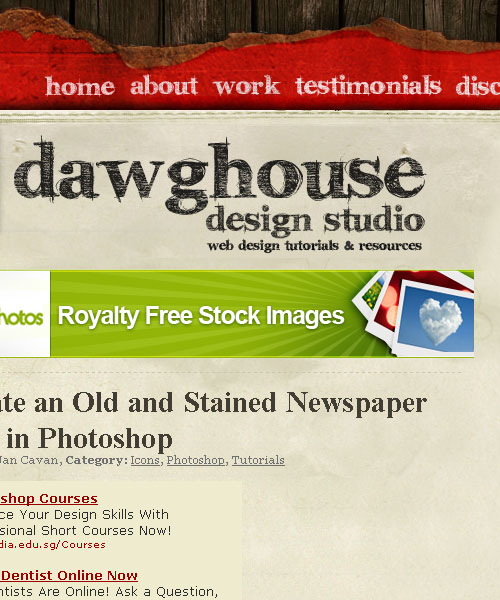
Dawghouse Design Studio
The Design
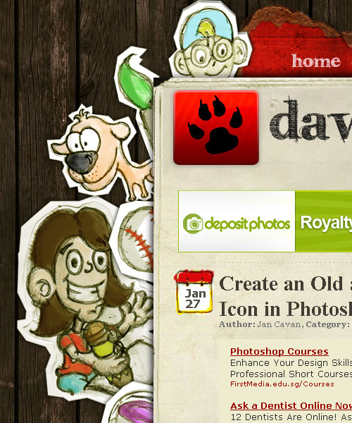
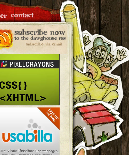
Doodle-ling used to be a distraction and usually a by-product of a child’s bored mind, recently it’s been getting more attention and becoming popular in the creative mind circle. “A doodle is a type of sketch, an unfocused drawing made while a person’s attention is otherwise occupied. Doodles are simple drawings that can have concrete representational meaning or may just be abstract shapes. -wikipedia.com”
Dawghouse Design Studio’s background doodles is very well made, it may look random at first glance but you can’t ignore that there’s a something going on in the concept as you look closer to each character or element, it depends a lot on ones interpretation or imagination of-course. As they all seem to looking and waving at you for dropping by the site, for me the girl holding the pencil seems to be waving to her friend in the approaching car and she seems excited to show-off her latest artwork, the dog is busy looking for his baseball while the boy who was playing with him hides to launch his toy “rocket ship”. That’s the fun thing about doodles it starts very random but your mind just starts associating each line, curve and character creating a story. It doesn’t matter if you’re the doodler or the doodle-viewer as long as you have fun with it.
I like this design, because it’s grungy (I’m a big fan of grunge styles) and fun in a childlike fashion, the colors are playful and even the textures helps to tell a back story of a clubhouse wall where kids post rainy day projects.
The Designer
Jan Cavan – is from the Philippines, she received her degree in Computer Engineering around 2005. She makes awesome icons and she’s giving them away from her website dawghousedesignstudio.com. Jan created this blog as a personal website, visual playground and testing ground which also aims to provide creative resources, tutorials, freebies and design inspirations to fellow designers and developers all over the world.
Fringe – T.V. series
The Design
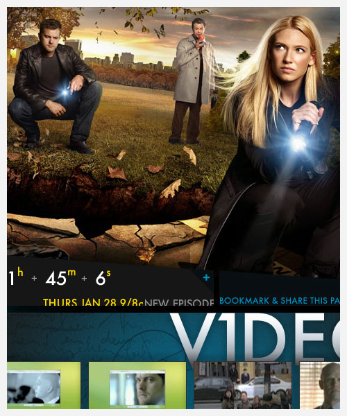
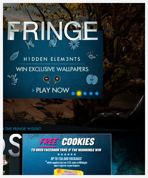
I’m a huge fan of photo manipulations, and obviously the TV series. The site’s design campaign strongly represents the mystery of the television series “Fringe” a cross between X-files, twilight zone and lost all my favorites.
Back to the design, manipulation of photos is an art as well as a skill, how you take existing images, combine them and make them look real takes a lot of ingenuity and patience. And it serves well in creating fantasy imagery that works well here in this background layout. The devil is always in the details, when you get everything right even the simplest of things like shadows and lights, direction of a non existing breeze then your final output would come out very natural even if the scene is surreal.
The Designer
I have nothing here, FOX studios probably has their own army of high paid designers behind all this. I would really like to get to know him or her if given the opportunity.
Batman-3D
The Design
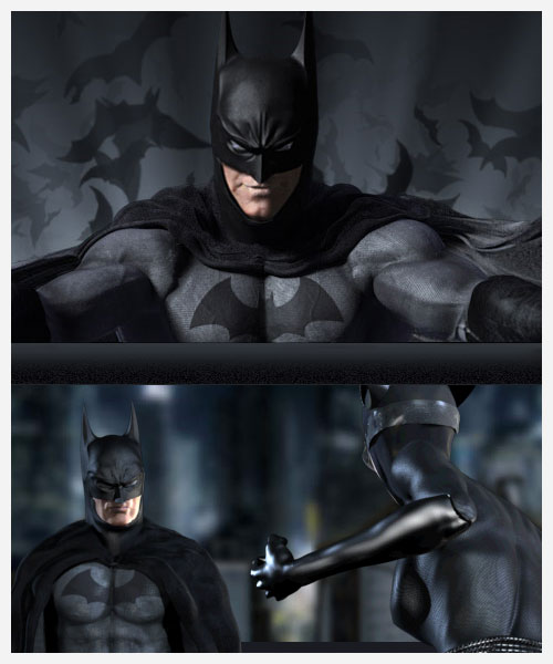
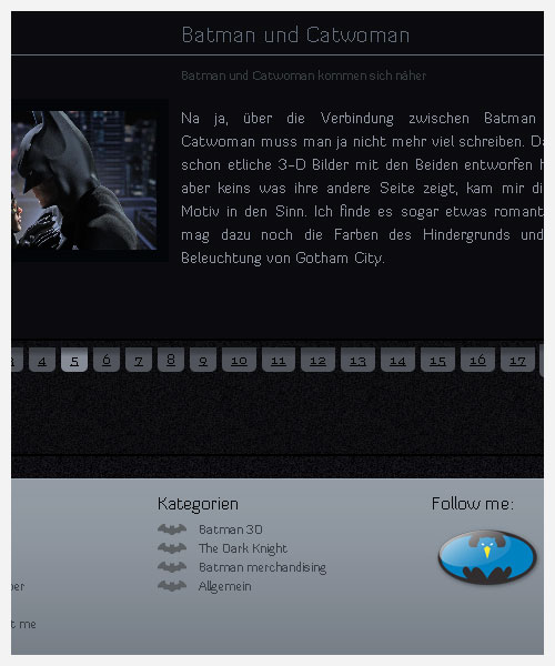
What would an article in pop culture be without your favorite comic super-hero, mine happens to be the “Dark Knight” himself and this website is a portfolio of a 3D artist dedicated to Bob Kane’s original creation, but since its written in German, I wouldn’t be able to provide a lot of details except what I can see visually. Like INDOfolio this site uses the “parallax effect” to make navigation more interesting and his style or representation of The Batman reminds me a lot of Alex Ross illustrations, very dark and morbid but then again it really works for his presentation of 3D artworks in Batman’s universe its like reading a comic book even if the web design is minimal he makes it up in visual content which is what I think he was aiming for, makes me wish I took up German lessons so I could understand what he wrote. Even his twitter iCon is modeled on the bat signal which is really cool and be sure to visit his twitter page to receive more Batman helpings.
The Designer
I don’t speak German so I wont attempt to understand what he wrote on his site although I know hamburger came from Hamburg, and I love German sausages… the next excerpt is from his site’s about page…
Schön, dass Du meine Seite Batman 3D über Batman besuchst, mein Name ist Achim Loobes und im Netz benutze ich anstatt Achim den Namen der Vigilant oder mittlerweile einfach nur Vigilant. Aber dies sollte man nicht zu wörtlich nehmen, man sagt mir nach, dass ich eigentlich ein netter Kerl bin :). Ich brauchte einfach damals einen Namen für ein Forum und ich war nicht der Erste mit dem Namen Achim.
I asked Google to translate it for me… and this is what I got…
Nice to have you visit my site Batman on Batman 3D, my name is Achim loob and the network I use instead of Achim, or the name of the Vigilant Vigilant only just now. But this should not be taken too literally, I was to say that I’m actually a nice guy:). I needed that time a name for a forum and I was not the first named Achim.
That’s all folks
It was a really busy week for me and I apologize for being late with publishing, I hope you guys enjoyed this article and may you find inspiration here in whatever project you are doing… If you happen to have anything to add here or related posts you have written that would help expand our knowledge with this subject please let me know or share them with us. Thanks for dropping by, see you next week.
Comments
5 responses to “Inspiration: Cultural themed website designs”