Twitter is such a powerful social networking and micro blogging service. It gives users the ability to reach out to a large audience with only a few line of text, which is why it’s a very popular tool with bloggers and especially online entrepreneurs because they are able to drive a lot of traffic to their website via twitter. You will find a bluish twitter bird icon link on most sites redirecting you to the site or site owners twitter account. So today I’m going to give you a walk through on how to make a cute twitter bird iCon in Photoshop.
Difficulty: Beginner – Intermediate
Duration: 30 mins – 45 mins (plus or minus)
Setting up the stage
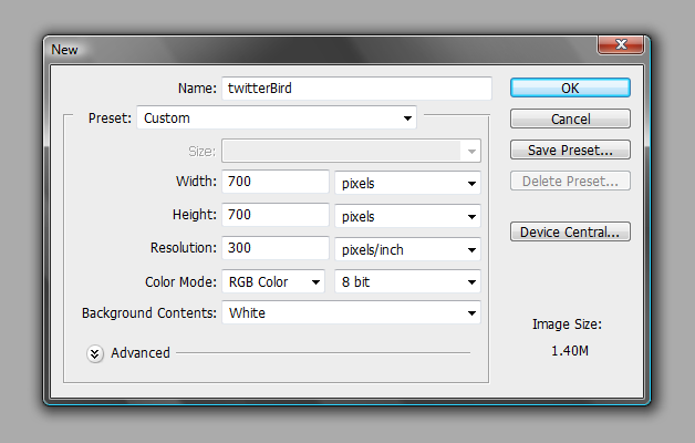
Let’s begin by creating a new file in Photoshop and name it “twitterBird”, then let’s give it a work area of 700 pixels x 700 pixels, we want it big so we will have enough space to play around with. Just keep the background color white for now.
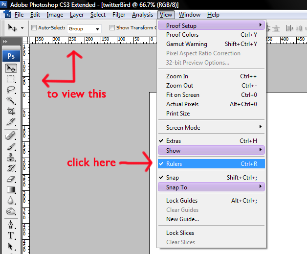
We need to make sure that our rulers are in view, if not go to View > Rulers and then just click on it, or use the short cut Ctrl + R.
Next drag your ruler from the left to the stage and keep it at the center, then drag the top ruler probably 1/3 from the top of your stage like this.
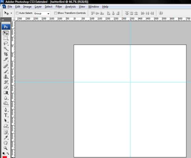
Creating guidelines is a good way to get your symmetrical elements aligned, just like the way Jeff Scarterfield does in his cartoon drawing tutorials as featured in Inspiration: How to Draw Cartoons Online – Jeff Scarterfield.
For the last guide, we will need our Ellipse Tool (U), make sure that Paths is selected in your tools options. Then simply drag it on to our stage to create an Oval shaped outline keeping the cross of the ruler guides inside the Ellipse.
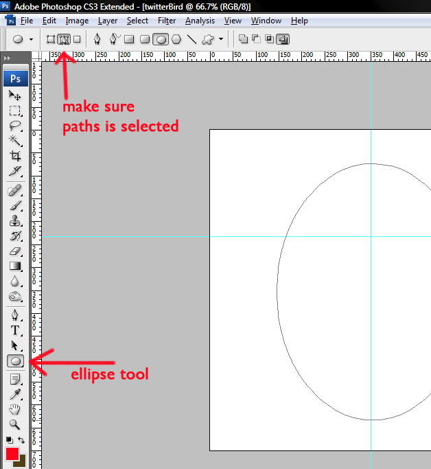
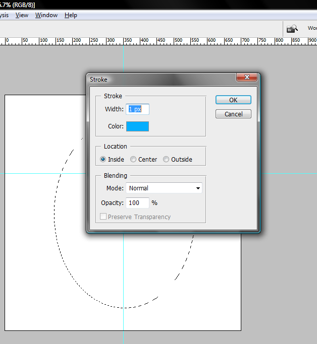
Hit Ctrl + Enter to turn it into a selection. You will see the running ants. Now create a new layer and name it “ellipse-outline” then go to Edit > Stroke set the width to 1px and color can be any color you want. This will be your outer guide, while the rulers are your symmetrical guide.
Start creating the Twitter bird
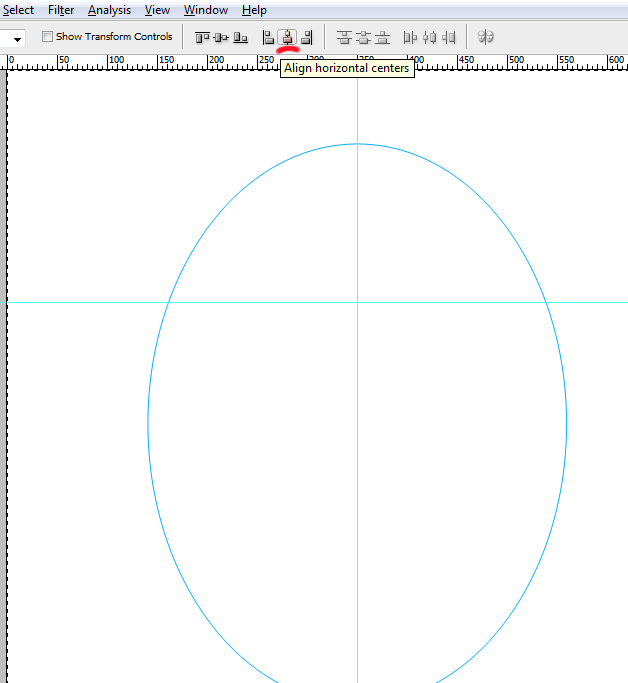
Your work stage should now look like this, almost everything we do from this point on should be inside the ellipse. If you have not yet centered your ellipse guide by now, just select the “ellipse-tool” layer on your layers panel. Hit (Ctrl + A) then click on Align horizontal layers option at your control selection bar near the top.
Twitter bird’s head
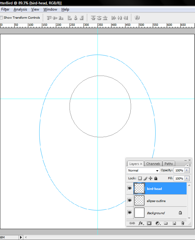
Now we are ready to begin, create a new layer on top of the “ellipse-outline” layer and rename it “bird-head”. Get your ellipse tool out again but this time hold the Shift key while dragging the ellipse tool inside your ellipse-outline. Drag it until you get something like a 220x220px circle path (check the info tab).
You should have something like this.
With your “bird-head” layer selected, go to Edit > Transform path > Warp (if your Photoshop is pre Warp option version play around with Distort and Skew) moving on, push the handles in, slowly and one at a time starting at the corners and work yourself around to put a light dent on our circle, if you are not sure how it should look like you can use the final output for reference.
Start warp
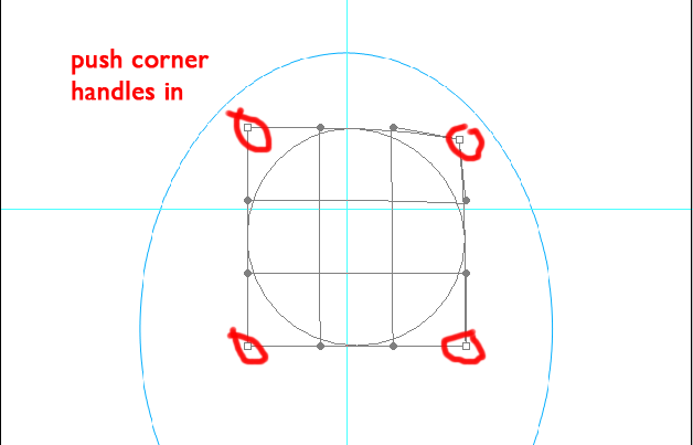
End warp
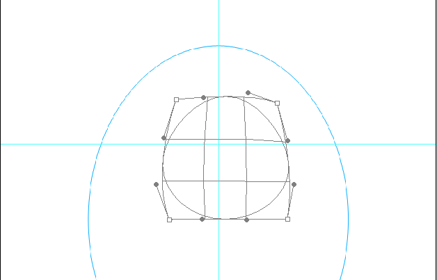
When you feel comfortable with the shape of the head hit the Enter key, and remember to just try and keep things clean don’t worry if it’s not perfect. We are now going to turn this into a selection by hitting Ctrl + Enter (ants should be marching here). With the “bird-head” layer selected and marching ants marching, click on the foreground option and pick a nice blue color from the color palette, I think #02A7CB will do fine then hit Alt + Backspace to fill your selection with the foreground color. Keep it centered to your cross guides. Your image’s shape should be similar to a “guitar pick” or a rounded “Dart’s wing”.
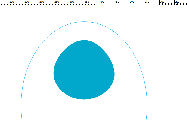
Next we need to give it some ruffled feathers for extra details, don’t be afraid it’s just a simple procedure. Create a new layer below your “bird-head” layer and name it “ruffled-feathers” then grab your Pen tool from the tools palette and starting from just below the top of our “bird-head” and the mid cross guide going to the left create a short path.
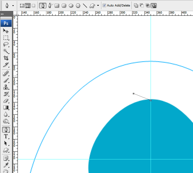
Drag out the handles to make an outward curve.
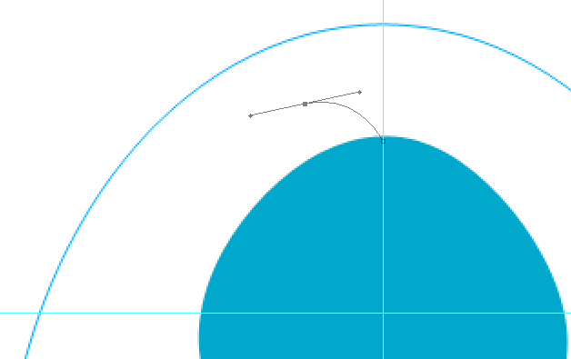
Cut one of the handles to create a corner by holding the Alt key and click on the 2nd point. You will know you’re in the right point when you see a (^) when you hover your mouse over it.
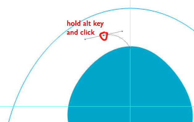
Bring it back to the head just below the 2nd point and drag the handles out again to create an inward curve. Cut the handle as before to make a corner and close it off by joining it to the primary point. You should get a shark fin looking shape.
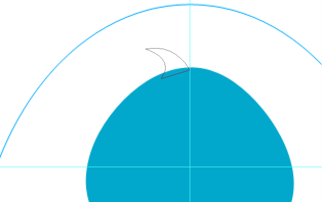
Do another one but slightly bigger and going in the opposite direction. Then after that go to the top of your horizontal guide near the left cheek start your path from there and do two more fins but this time they should curve in the same direction like waves. Actually you can play with this and do as many as you want that you feel would compliment your drawing. But for this tutorial we’ll stick with this. So by now you should have an image similar to this.
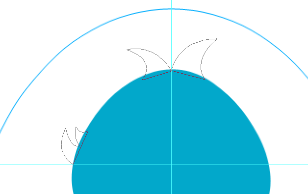
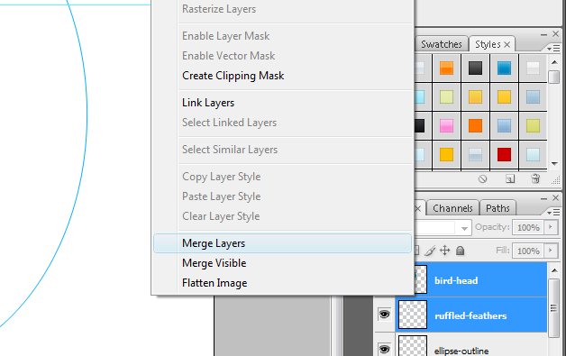
Hit Ctrl + Enter to turn it into a selection and fill it with the same blue color. We will now merge this two layers together so while your “ruffled-feathers” layer is still selected hold your shift key and click to select the “bird-head” layer. You should have both layers hi-lighted now, right click on it to open your options menu and click merge layers.
Now it’s time to add some definition and hi-lites. Pick a darker blue for the background color, I’m using #2A8A9F then with your newly merged layer selected press Ctrl and click on the merged “bird-head” layer, this will turn the outline of your image into a selection. Click on your gradient tool or hit (G), then make sure your gradient effect is on Radial Gradient and drag you gradient horizontally starting from the upper left hand going down.
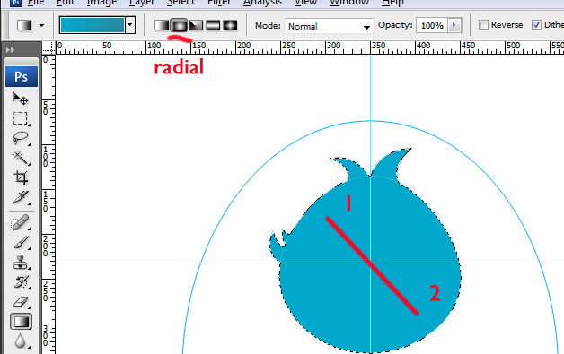
Your gradient gave your image a bit of depth, now we’ll give it some outline shadows, Right click on your layer and open your Blending Options and tick on Inner Glow then match the settings to what I used here pick a nice shade like #0C8FB7 for your color and click OK.
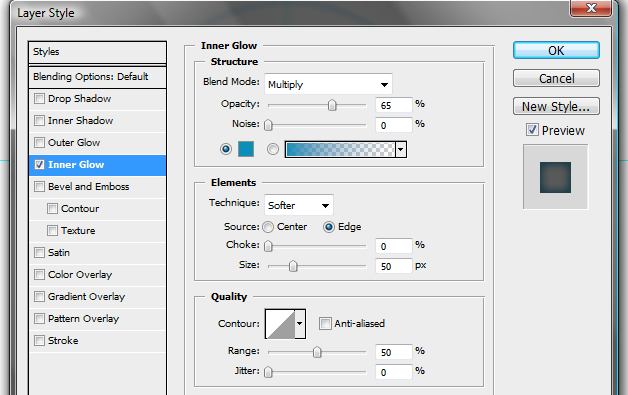
Twitter bird’s eyes and brow
We’re now going to add some features like eyes, eyebrow and beak. We’ll use our Ellipse Tool again and create a small version of our “ellipse-outline” layer inside the “bird-head” layer. You can zoom in a bit to get a better look of what were doing. Drag your ellipse tool until you get a nice sized ellipse. What we want is an exaggerated version of the eyes.
When you’re happy with the ellipse for the eyes go to Edit > Transform Path > Distort because we want our ellipse / egg shape wider at the top and narrow at the bottom.
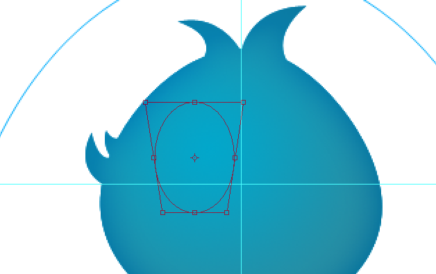
Hit enter then go to your Paths tab and drag your path to your create new path button and rename it “eye” we want to save it for later.
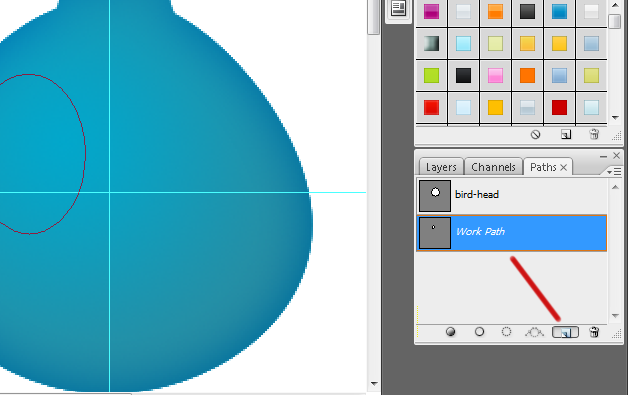
Return to your layers panel and create a new layer on top of everything else and name it “shadow”. Go to your foreground color picker and find a nice dark blue with a hint of gray hue something like #1F4D57, then hit Ctrl + Enter to turn your path into a selection. Select gradient again then from the gradient picker at the top choose foreground to transparent and your “Gradient Effect” to linear gradient then just drag it diagonally across your selection starting from the outside of your selection.
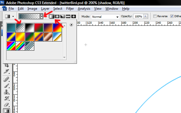
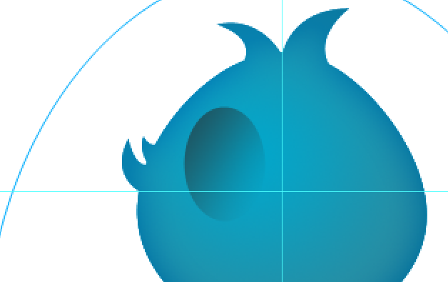
When you get the right amount of shadows, create a new layer and call it “eye” then go back to your Paths tab and select the “eye” layer path we saved earlier. You should have the path we used to create the “shadow” layer. Turn it into a selection (Ctrl + Enter) then set your foreground color to #FEFEFE and your background color to #DCDCDC, set your gradient picker to foreground to background and gradient effect to radial, then drag it diagonally across your selection.
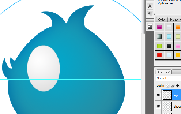
Reduce the size of this layer slightly until you see enough amount of the shadow layer behind it and rotate it a few degrees counter clockwise.
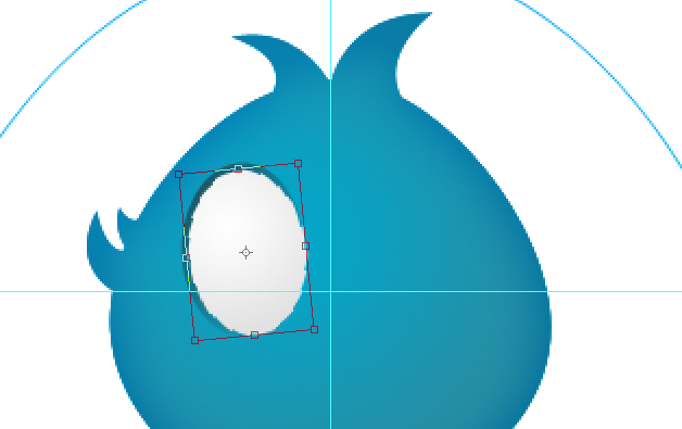
Go back to your “Paths” tab (you better get used to it we will be going back to the paths panel a lot in this tutorial) and select the “eye” path layer one more time, with your “eye” path layer still selected create a new layer in your layers panel and rename it “iris”. Set your foreground color to a nice blue color like #02B0E6 and your background color to a lighter version like #99DFF5 we will use the same gradient effects settings as the original “eye” layer image. Turn your path into a selection and start dragging your gradient across this selection just like before. Resize this layer to make it smaller than the “eye” layer image probably around 30% – 45% depending on what looks good to you. Rotate it clockwise leaning opposite the previous layer’s position. Use your personal judgment to make some adjustments. Right click this new layer and go to “Blending Options”, add an “Inner Glow” and use another blue color like #0B3D4B for the color glow, then set the size to 12px click OK.
This time we are going to use our “iris” layer to make a selection. So go ahead and turn it into a selection like what we’ve done for the “bird-head” outline. Then create a new layer and name this layer “gradient”. Change your foreground color to white #FFFFFF and your gradient picker to foreground to transparent then drag your gradient starting from outside the selection like what we did for the “shadow” layer, hit Ctrl + D to turn off the selection. Now take your pen tool out and make a path across the “gradient” layer. Start from the upper right hand side going to the lower left side. Then drag your handles to make a nice upward curve make a big loop outside the iris to cover the whole lower area, you can now close your path and turn it into a selection then hit “Del” or “Delete”. Change this layers opacity to somewhere around 65%. We will then link these two layers (“iris” and “gradient”) by selecting them both, and with a right click of your mouse on the highlighted layers click on the “Link Layers” option. You should be able to see link chains on your selected layers which mean we can now move these two layers together by selecting one of them.
Check your work against mine and do some tweaks where it’s necessary.
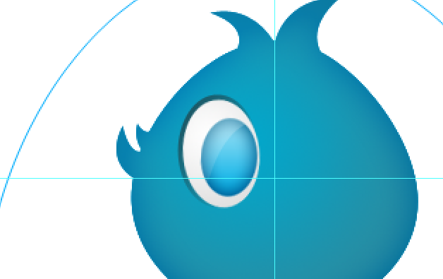
One more visit to the paths tab and again select our “eye” path layer, return to your “Layers” panel and create a new layer. Name this layer “pupil”, do the same procedure as what we’ve done for the “iris” layer only we will use a darker shade of gradient. For this one set your foreground color to #0D94B9 and background color to #08516B, add an “Inner Glow” of #0C8FB7, “Blend Mode” set to multiply, Opacity 45%, Size 10px. Rotate image is optional.
Let’s add some glint to give the eyes more life. Create a new layer and name it “glint” take the ellipse tool and while holding down the “Shift” key drag it inside our “iris” layer to get a small circle shape. Turn it into a selection and fill it with white #FFFFFF. Make sure you position it a little outside upper left of the “pupil”. Now go to Filters > Blur > Gaussian Blur and give it a nice 1px radius.
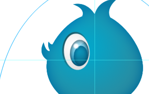
That should do it for the eyes, let us now work on the eyebrow. I know birds don’t have eyebrows except for the cute ones. So we will make this really simple.
Let’s create a new layer and call it “eyebrow” then take the ellipse tool again, and while holding down the shift key create a circle as wide as your “iris” layer, then turn it into a selection and fill it with #08516B. Turn off your selection and grab the handy dandy pen tool make a horizontal path halfway near the top and make a curve, make sure you have a crescent shape facing down, do a big loop to cover the entire lower portion and close the path, hit “Del”. Move the eyebrow image on top of the eyes and rotate it clockwise just a little bit to give your drawing more character.
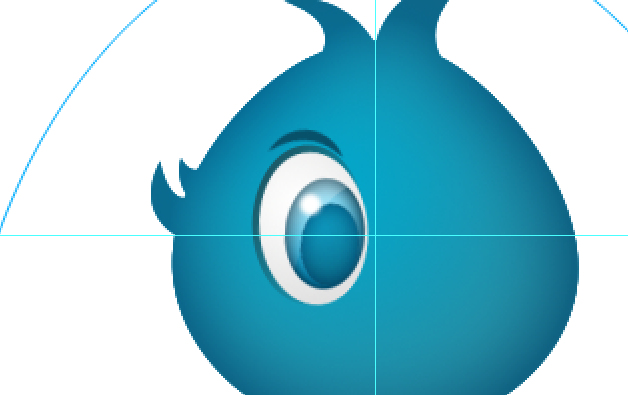
Group your eye layers by selecting all of them (Ctrl + Click) on each layer used for the eyes including eyebrow then drag it to the Create a new group button (the folder looking button) third from left.
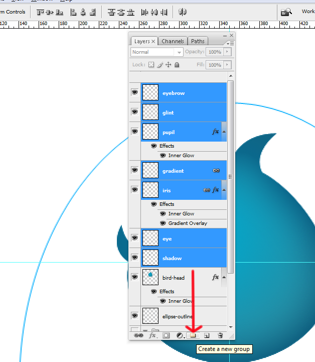
Rename the group folder “left eye”, then make a copy of the group folder by dragging the whole folder to the Create a new layer button beside the Create a new group button and rename the copy “right eye”. Select the group “right eye” then go to Edit > Transform > Flip Horizontal and move it to the right and make adjustments based on your vertical guides.
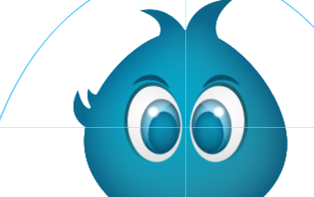
Twitter bird’s beak
After you finish making final adjustments to the eyes it’s time for us to start making a beak for our Twitter bird. So create a new layer and call it “beak”.
Take the rounded rectangle from your shapes tool and make the radius around 10px. Drag it on to our stage, make it a nice rounded square up to around 50 x 50 pixels, to turn it into a selection and fill it with yellow #FDCB01.
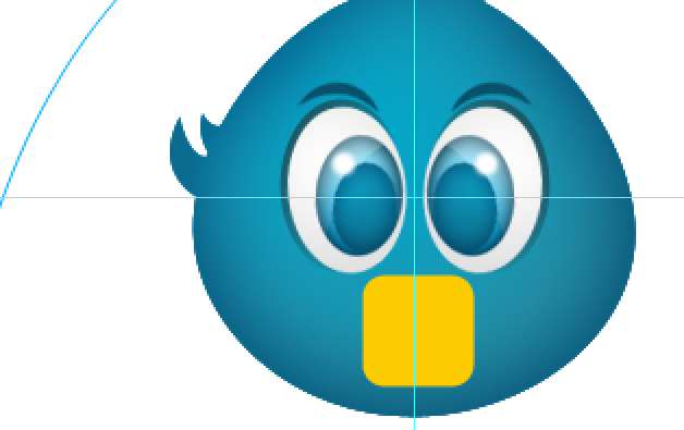
Edit > Transform > Rotate it around 45 degrees so it becomes more like a diamond than a square.
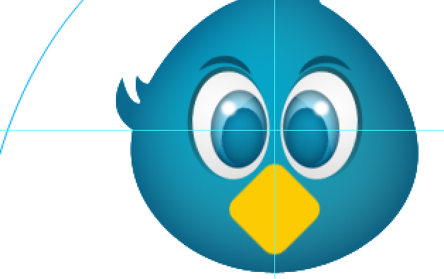
Then Edit > Transform > Scale down to about 10% – 20%, don’t bother holding down the Shift key here because we want it to be pinched but keep the width as is.

Ctrl + click on the “beak” layer to make a selection. Then create a new layer and call it shadow. Take the “Rectangular Marquee” tool and set it to “Intersect with selection”. Drag the “Rectangular Marquee” tool starting from the bottom ending midpoint of your selection. Make sure you are at the horizontal center of your “beak” layer. Let go of the marquee tool, you will see your selection changed to only half of the “beak” layer outline. Fill the new selection with a dark yellow, almost brown #322801. Now go to Edit > Transform > Warp then push the two inside handles from the top going down. What we want is to have a nice outline of the upper beak and lower beak, when you’re done hit Enter.
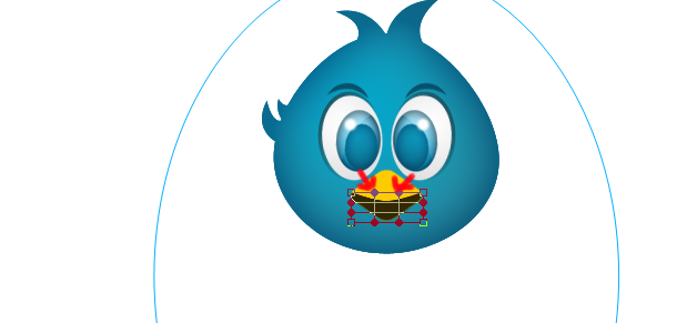
Next we’ll just give our beak a very light hi-lite to give it more character. Create a new layer and name it “hilite”. Pick a light yellow for our foreground like #ECE294. Set your gradient to Foreground to transparent and use the Diamond Gradient effect. Ctrl + click on the “beak” layer so we can get a selection. Then drag your gradient across the selection from the top going down.
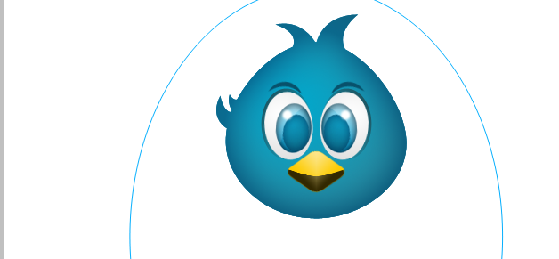
Take a moment to look at your work and do some adjustments that you think your drawing needs. The hard part is over. We are almost done. It’s time to give our Twitter bird a body, it’s wings and it’s feet. But first group your beak layers so we have a nice looking layers panel. And should the need to move the beak around arises we could just select the group and move it in one motion like what we’ve done for the right eye. Don’t forget to name your group, let’s just call it “beak”.
Create the Twitter bird’s body
OK for the body create a new layer above the ellipse-outline layer because we want this behind the head image layers. Name this layer “body-outline” then go back to your “Paths” tab and duplicate your “eye” path layer, just drag it down to the Create new path button and rename it “body”. Next we’ll move your body path below your Twitter bird’s head image by using Ctrl + T and then while holding down the Shift key use the arrow keys to position your path. Then Scale it up to match your heads width holding down the Shift key so it stays proportion. Now make the same adjustments we made for the head and make the top portion narrower than the bottom by using Edit > Transform > Distort. Adjust the alignment to match the head.
Then with your warp tool pull on the handles and make the bottom part less pointed and more rounded. Similar to what we did for the head.
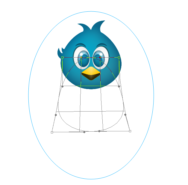
Make sure you have the “body-outline” layer selected then turn the path into a selection and using the gradient settings we used for the head (foreground color = #02A7CB / background color = #2A8A9F / gradient effect is on Radial Gradient) fill your selection with this gradient.
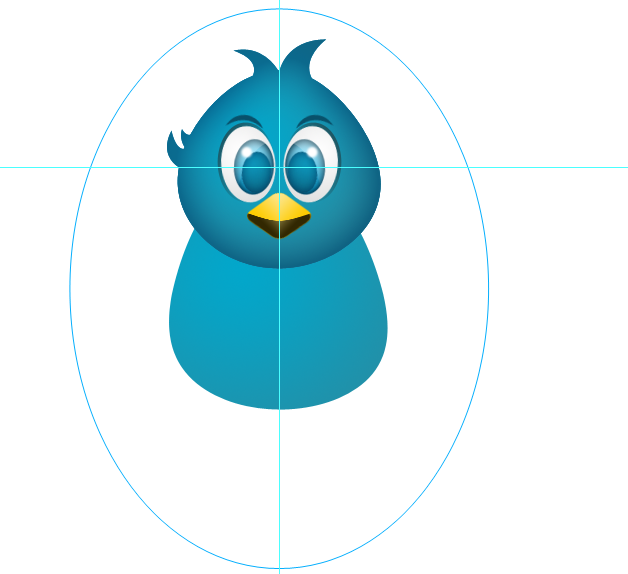
Locate your “bird-head” layer select it, then Right click on it and choose Copy Layer Style now Right click on your “body-outline” layer and pick Paste Layer Style. You now have the same Blend mode effects as the head.
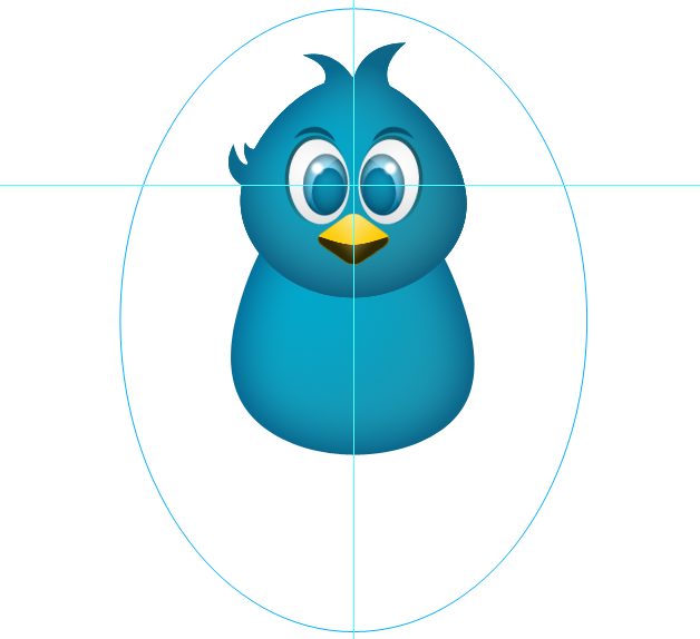
Now use the “body-outline” to make a new selection, create a layer on top of the “body-outline” and call it “breast” set your foreground color to a very light blue #D4F6FD and your background color to #51DEFD, gradient effect Radial, drag it from the center going out.
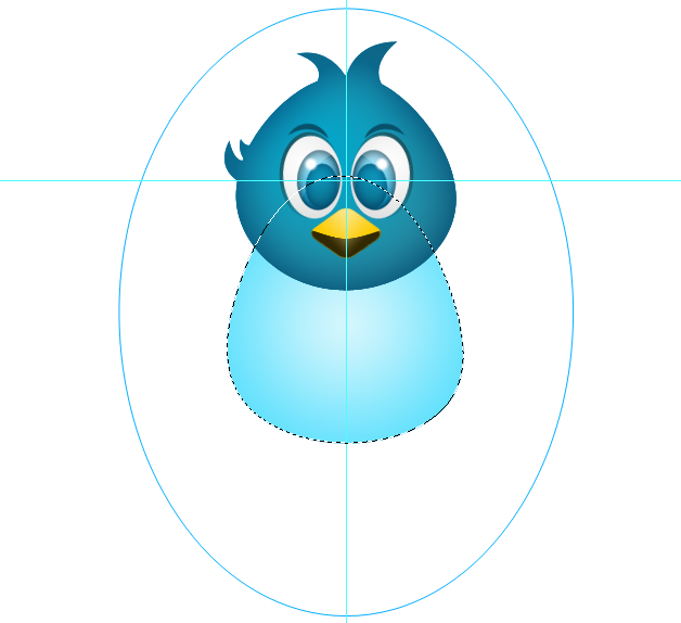
Edit > Transform > Scale it down 30% more or less. And check alignment.
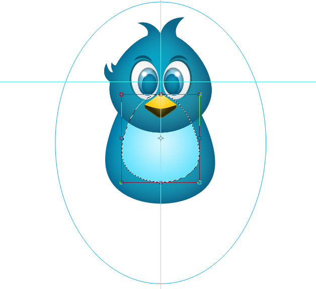
Move it down a bit and give it some Inner Glow of #B3F0FD with 65% Opacity and 10px size.
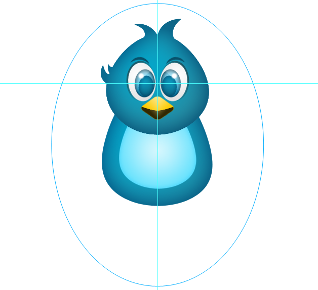
Group the body layers and name it “body”. Now we are ready to make our Twitter bird fly.
Let’s have some Twitter bird wings
Create a new layer below the “body” group folder and call it “wing”. Take your Ellipse Tool and without the Shift key make a nice thin ellipse like a small grain.
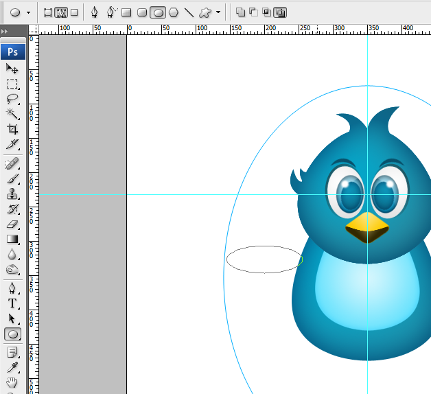
Edit > Transform > Warp your new ellipse path to make the left side rounded and the right pointed. This would be similar to an extreme warped version of our body outline.
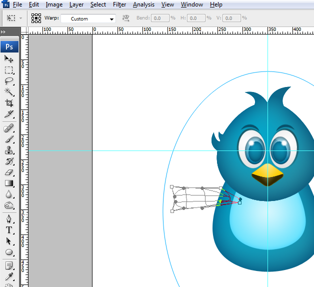
Turn it into a selection and fill it with gradient (foreground color = #02A7CB / background color = #2A8A9F / gradient effect is on Reflected Gradient) then Blending options set to (Inner Glow > Blend Mode to Multiply > Opacity to 45% and size to 10px).
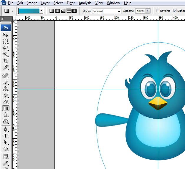
Rotate this layer clockwise to have an angle and move it near the top of the body a few pixels below the head. Make a copy of this layer and rename it “wing 2”. Drag the image “wing 2” below your “wing” and rotate this layer, now overlap it with the original image so it doesn’t show any space in between the two layers and try to match the original wing’s direction. Push the second wing a few pixels in. Then duplicate the second wing layer and call it “wing 3” make the adjustments same as that of “wing 2”.
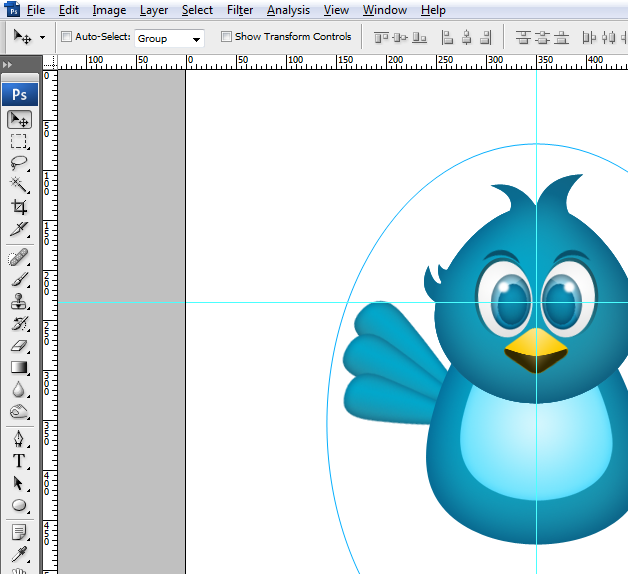
Group your wing layers and rename it “left wing”, duplicate the group and call it “right wing”. Edit > Transform > Flip Horizontal the group “right wing” and move it to the other side of the body.
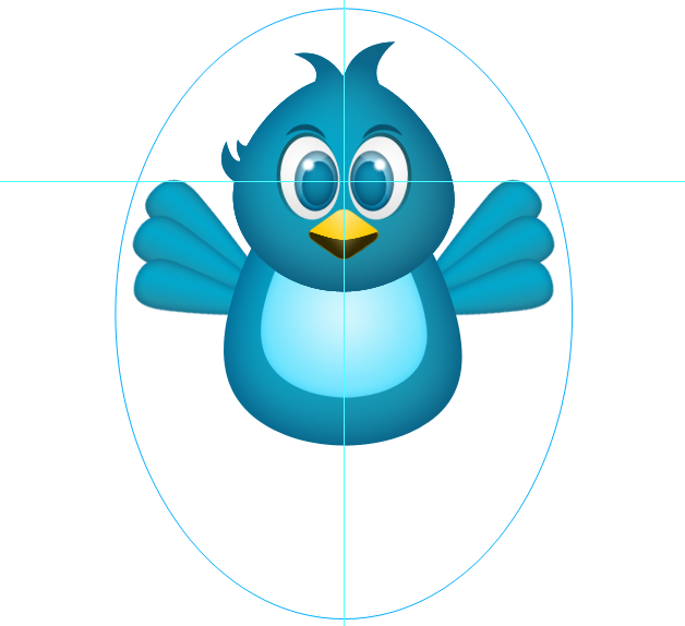
Now we just need to make a nice pair of feet and our Twitter bird project will be finished.
Let’s give our Twitter bird a nice pair of feet
We don’t need to make this part fancy so let’s create a new layer on top of the “ellipse-outline” and call it “left-foot”. Using the Rectangular Marquee Tool (M) create a vertical rectangular shape and fill it with a gradient (foreground color = #FDEBA1 / background color = #FDCE10 / gradient effect is on Reflected Gradient ) start from the center going to the right.
Then take the pen tool and make “W” like cuts at the top.
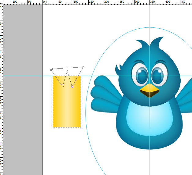
Hit Ctrl + Enter to make the selection then “Del”. You will have something like a long king’s crown, now Edit > Transform > Flip Vertical and then Edit > Transform > Distort. Drag the top left and top right handles downward going to the right. Then push the top left and right handles in to make your image narrow at the top and wide at the bottom.
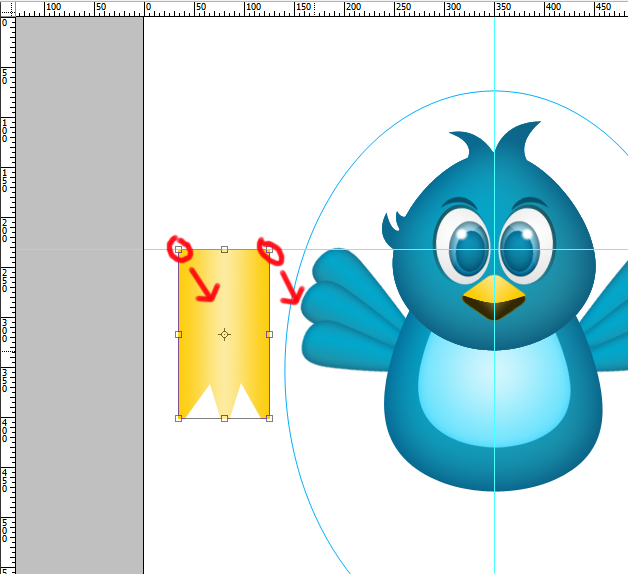
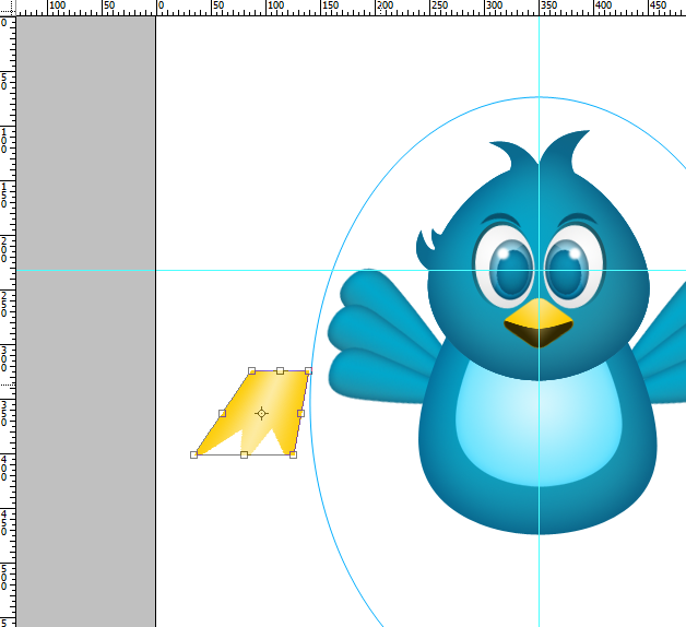
Now scale it down and position it under our “body”. Add some inner glow #BC9601 with 65% Opacity and 15px size. We will just duplicate our “left-foot” layer and rename the copy “right-foot”, go to Edit > Transform > Flip Horizontal then move “right-foot” layer to the opposite side.
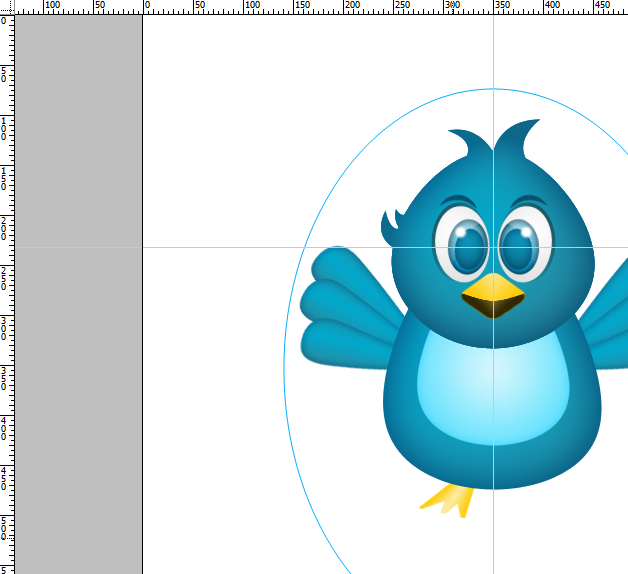

Hide the ruler guides by pressing Ctrl + (: ; key) then for your “ellipse-outline” just click on the eye icon of the layer, just like poking it in the eye :D. And now you may admire your work!
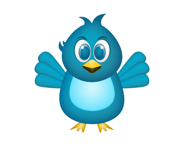
Let’s have a short recap
Aside from creating a really simple but cool drawing of a Twitter bird, we’ve also learned:
- The importance of using guides
- How to use the gradient tool
- How to play with the pen tool
- How to select, link and group layers
- How to save paths
- And how to control blending options, copy and paste it on another layer
Fini! – follow me on twitter @xzykho
In the end it’s not the final result that matters in this tutorial it’s the process, like the great Bert Monroy always says… “It’s not work, it’s play. It’s not the end result that’s important it’s how you get there.”

Comments
3 responses to “Create a cute Twitter bird iCon in Photoshop”