I’ve gotten to know some really interesting people from the web because of prodigalconcepts.com and most recently I’ve had the opportunity to be asked to help out vectorfantasy.com to spread the word of their membership drive. Vector Fantasy is a resource website from Romania owned and maintained by Alin Herciu.
Being a scavenger of UI Packs myself, I just couldn’t pass up the opportunity to help another resource website. So I’ve decided to write a short tutorial using some of the free web icons and vector resources available on their website.
Quick question
Have you ever found yourself in need of a website design but time was not on your side? If you are just starting out, chances are you have been invited to go for an interview but after a few questions (where most of the answers were already stated in your CV / resume anyway) were asked to do an impromptu design so they can “asses” your skills. I’m not a fan of quickies but luck favors the prepared. So here is a nice little tip for all who may find themselves in a tight situation.
Find and keep
If you spend a lot of time on the web be sure to save resources you find along the way that may be useful to you one day. One man’s free resource is another man’s treasure. Bookmarking the website will save you from time to time, especially since you can access your Google bookmarks on any Chrome browser, (internet connection required of course).
What we will be making
This is a simple mock-up up of a (bogus) company website, I will only touch up on the basic framework and will not go deep into the details of the entire build but enough for all of you to know how I ended up with this.

What we need (free UI Packs)
Vector Fantasy’s free web icons
Fonts: These are free fonts please use them according to the authors terms and conditions. And if you can afford it, please, please, please donate to keep the freebies perpetually free.
Steelfish | Clarendon BT | Lobster
Optional Add-ons
Setting up the stage
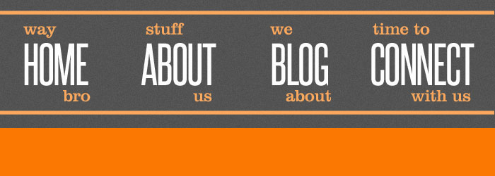
I started with a 1200 x 900 pixels work area and filled it with #FAFAFA. Then I used the rectangle tool which is set to Shape layer to mark my content area at 960 x 900 pixels, this layer can be deleted or hidden after placing the ruler guides. I like using shapes so I can resize them later as necessary.

Header and Navigation
Take the Rectangle Tool then open the Rectangle Options located at the top Tool Options Menu. Select Fixed Size and type in 1200px for the width and 120px for the height. Fill it with the color #535353 and rename it “header-bg”.
Now choose the font Steelfish from your fonts family list and key in HOME all caps, set the Font Size = 36px > Tracking = -25 > Anti Aliasing to Crisp.
Ctrl + Click on the “header-bg” layer to turn it into a selection and with your HOME layer selected use the Align Vertical Layers option to keep our first link centered.
The next font we’ll use is the Clarendon BT, I’m using Font Size = 12px > Tracking = -25 > Anti Aliasing to Crisp. Key in “way” and “bro” all lower case.
Refer to the final image sample for positioning.
Group “HOME, way, bro” together so we can move them around easily, and rename this group “- home-nav” I often use dash or hyphen when I want to arrange my layer groups in a nested order so I could locate them easily if ever my layers grow (which often happens) and I have to go back and forth on my layer list.
Example:
navigation (is the main group layer)
– home-nav (sub-group layer)
– about-nav (sub-group layer)
and so on…
Duplicate “- home-nav” and rename the duplicate “- about-nav” move it to the right using Shift + Right Arrow Key then edit the links to “About, stuff, us”. Do this two more times remember that the content is optional but you can use my final output for reference.
1. Add noise
2. Add lines
The Logo
OK now let’s get started with the logo, I have to be honest I did not have a clear direction what I was going to make when I started out on this project. I simply wanted to use the type Arial (Black) for the logo because it was safe and very readable. Then I thought of a different color punctuation as accent. Orange #FC7802 seemed like a nice choice to move away from my usual color choices as I always gravitate on blue or black when I work on personal projects.
I came up with the logo Wrenched. after I have played with a few mock-up brand names, then I found the spanner in the icon folder from vector fantasy which inspired me on the final output. I thought it would work nicely with the punctuation accent. So I simply opened the PSD file for the settings icon and changed the main colors to #FAFAFA, while the handle accent became orange as well. I used it to replace the “Letter d”. For the header background I went with the color #535353.
![]()
Slider
From the wrench (spanner) on the logo it just seems perfect to follow it up with some kind of automobile somewhere. Create a new layer with the rectangle shape tool set to 1200 X 250 pixels, color to #FC7802, download the “Vector Retro Hot Rod” and open it in illustrator. Copy the purple hot rod (without the shadow), as a smart object in Photoshop, flip it horizontally and rotate it a little bit to match the perspective then add some shadows using the shape tool and brush tool.
It’s a good practice to make your images facing in so the users line of sight will not trail off outside your content area
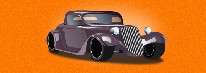
To give it some hi-lite add glow using the ellipse tool, give it #FBB06C color then add Filter > Gaussian Blur | Radius: 2 – 4. Use the Lobster font for the title of the copy on the right and the content can be any sans serif font in your fonts library.
Main Content (Company profile iCons)
Set up the ruler guides to divide your work area into 3 columns. Open the following PSD files from the Web Design Icon Set folder, Headset, Hand Touch and Man Talk, replace some of the key colors for accent. You can use the Clarendon BT for the company profile headings.
![]()
Add the content.
Footer
The footer is pretty self explanatory. Use the same guidelines as the company profile section (divided into 3 sections) and add the contact details, social media links and subscription option. You will find some interesting social media icons here Sharing the love of free iCons. Use the Steelfish font for the headings.
Wrapping up
For some depth add noise to all the background, you may want to convert them to a Smart Object first to preserve the layer. Set the Amount – 2, Distribution – Uniform, and tick on Monochromatic. As you can see you can build a simple but useful mockup in a very short time with the help of some ready made UI Packs like Vector Fantasy’s freebies, you can also find ideas as to the direction of your design with ready made resources. Some hardcore designers may not agree to this but I think that if resources are available why not use them to create something that you can call your own.
If you ever make something out of the freebies on Vector Fantasy, feel free to share the links here by using the comments area.