The “Titanic” movie was re-issued earlier this year to commemorate the centennial anniversary of RMS Titanic‘s tragic maiden voyage and have been 3D-tized for your viewing pleasure. It also may or may not have anything to do with James Cameron diving in the Mariana Trench for “NatGeo Society” but that’s not really why were here is it?
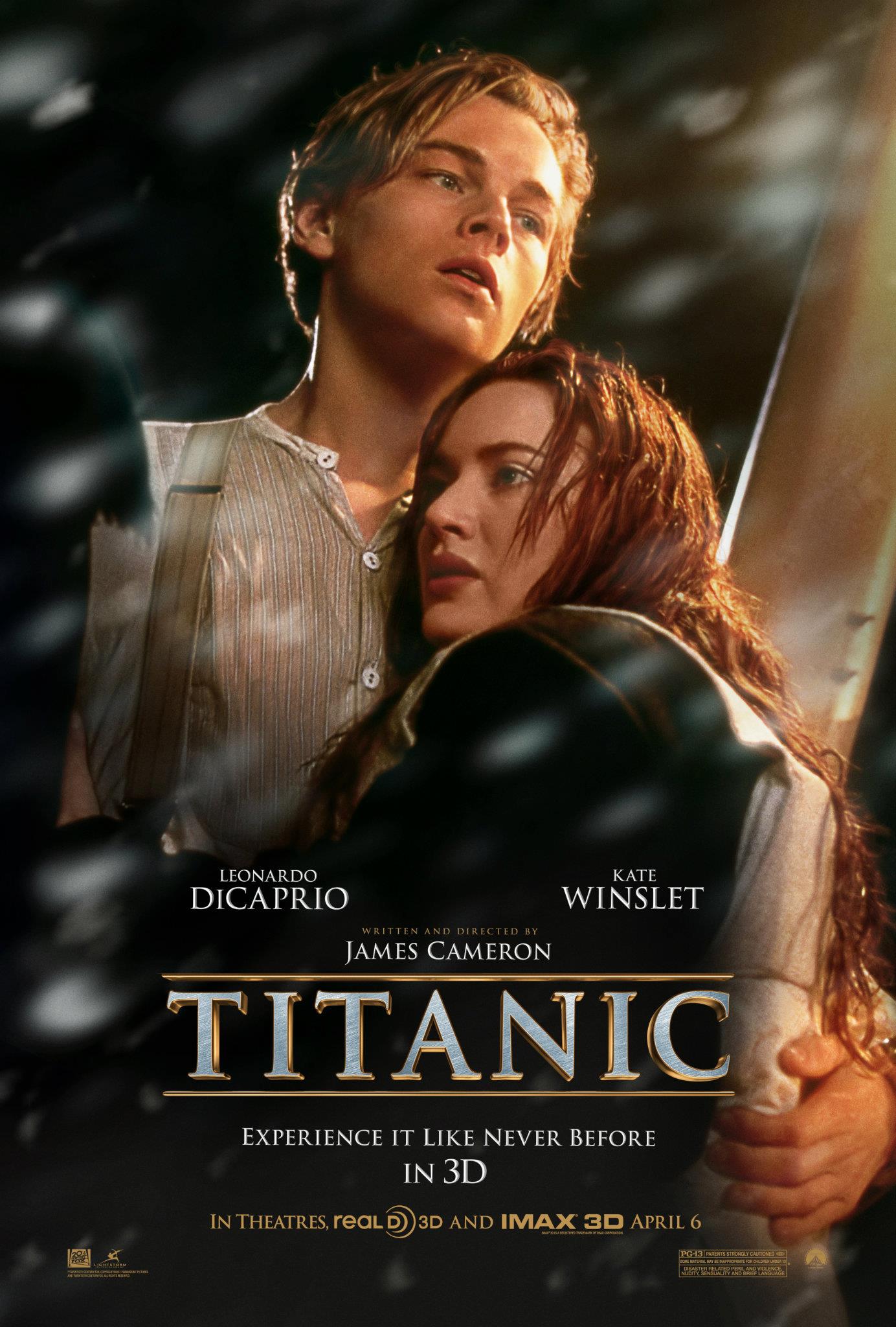
Seeing the reworked movie poster at the train station got me inspired to try and recreate the title type treatment, so if you guys are ready to dive into this with me, let’s grab our Photoshop gears and make sure you inhale because were going really deep. (Note: If you want you can just Google the keywords “Titanic 3D poster” for a reference image we can use as a guide.) Search for a large sized image so we can see the details clearly. I found one from hollywood.com Titanic 3D poster. In case the source closes shop I saved a copy HERE for reference purposes only. (Note: This image does not belong to me, we are using it to recreate a close replica.)
What we will be making
 type treatment in Photoshop")
Resources
Font – J.D.- Closer/LWTUA Bold
We will be working from scratch, no stock images or patterns needed. You can use any basic “Serif” font you have in your local drive fonts directory, just try to get something as close to the reference image font style as you can.
I will be using the font J.D.- Closer/LWTUA Bold from fonts2u.com, if you don’t have one in your font library just head on over to 10+ free font resource websites where I’m sure you will find something close.
Just remember that we don’t need to be exactly the same as the original because our main goal here is to try and come up with the type treatment effect and learn a few Photoshop tricks along the way while having fun of course.
Setting up the stage
Let’s go big so we can see things a bit better, create a new file and name it “titanic” make this 1000 x 700 pixels. Fill this new layer with #2b2b2b color, and rename it “background”.

Type settings and 3D effects
Select the Horizontal Type Tool (T), type TITANIC (uppercase), then apply the following character settings as you see in the image below.
- Font: J.D.- Closer/LWTUA (or another Serif of your choice)
- Weight: Bold
- Size: 150px
- Tracking: 50
- Color: #B68B46
- Anti-Aliasing: Crisp
Use the Vertical and Horizontal align tools to keep it in the middle of our work space.

If you look closer to the letters A and N, you can see that we need to give them more space from each other. To do this simply highlight the letter A and from the Character Settings change the Tracking to 100.

Time to 3D-tize our type
This next step was an idea shared by my good friend Brian Jones of seven27creative.com which I modified for this tutorial.
To make this process more bearable we will use Photoshop Actions to automate the repeating tasks we need to do.
Set up Actions
Open Actions by going to the tab menu Windows > Actions (Alt + F9 *on a PC). Click the Folder icon Create new set option and rename this set “titanic-type”.

Make sure you have “TITANIC” type layer selected before proceeding. Then right next to the Create new set Folder icon is the Create new action button, click this and a New Action dialog box will open, rename this action “set-type”, hit Enter or click Record to start recording your actions in Photoshop. (Note: everything you do at this point inside Photoshop will be recorded so avoid repetitions and Undo mode *Ctrl+ Z)

Record your actions
- Duplicate “TITANIC” type layer (Ctrl + J)
- then Edit > Transform > Scale (Ctrl + T)
- Click on Maintain aspect ratio (chain icon) between Width and Height
- Set Width: 100.5% then click Enter 2 times to commit the changes
- Select the Move tool from the tools palette, then with the Arrow keys go 1 Up
- Duplicate the copy (Ctrl + J) and were done…
- Stop recording (square icon next to the red circle)
Note: Use the shortcut keys
Note: Use the shortcut keys
Now that we have our Action set up and we have stopped recording, delete the 2 “TITANIC” copies we just made so we can have a clean layers panel again with only the “background” and the “TITANIC” type layer.
Time for a little bit of magic. Duplicate the original “TITANIC” type layer then hide it simply by poking the eye next to the layer (were keeping it for back-up), rename the new “Titanic copy” >> “TITANIC”. Now go to Layer > Type > Convert to Shape.
Then select “set-type” from our Actions menu. Click the Play selection button, repeat this 5 times, and your last type layer copy should be “TITANIC copy 10”. Your stage should have something like this.

Brushed metal effect
Now create a new layer (Ctrl + Shift + N) and rename this layer “brushed-metal”. Set the Foreground color to #5D7F89 and the Background color to #CAD2D4. We need to clip this layer to “TITANIC copy 10”. Hold down Alt key then hover your mouse between the “polished-surface” layer and the “TITANIC copy 10” layer. When your pointer turns into 2 circles and an arrow click it.
Add Filters
1. Filter > Render > Clouds (Try to get a balanced distribution of the foreground and the background colors per letter, use your personal judgement here. You can repeat as many times as necessary *Ctrl + F.)
2. Filter > Noise > Add Noise
- Amount: 18
- Distribution: Uniform
- Monochromatic
3. Filter > Blur > Motion Blur
- Angle: 15°
- Distance: 15px
4. Filter > Noise > Add Noise
- Amount: 4
- Distribution: Uniform
- Monochromatic

Copy “brushed-metal” layer and clip it, then change the Blending Mode to Overlay and apply Image > Adjustments > Desaturate (Shift + Ctrl + U).

Prepare the layers for detailing
Clean up our layers panel a bit. Select the shape layers “TITANIC copy 8” … to “TITANIC” and group them together, rename this group “TITANIC-copies”.
Copy this grouped layer (just for back up), go to the copy, right click on it and select Merge Group, rename this merged group layer “TITANIC-merged”.
Hide the “TITANIC-copies” layer.
Time to work on the details
Blending Options
TITANIC-merged layer
While you’re still in the “TITANIC-merged” layer right click to open Blending Options and give it a Gradient Overlay with the following settings.


Your image should look something like this by now.

TITANIC copy 9 layer
Apply some styles with a Drop Shadow and a Stroke from the Blending Options with the following settings.


TITANIC copy 10 layer
Give this layer an Inner Shadow and an Inner Glow with the following settings.


See the difference of the two styled layers

Finishing touches
If you look closer at what we have so far the types edges are sharper than the reference image.

To fix this create a new layer above the “TITANIC-merged” layer and rename this “edges”, grab a nice round Brush with these settings.
Brush settings
- Diameter: 9px
- Hardness:100%
Set the Foreground color to #B68B46 and start brushing on the edges, brush front to back.

After you have covered all the necessary edges, Copy Layer Style from the “TITANIC-merged” layer and Paste Layer Style to the “edges” layer.
If you are satisfied with the results merge this 2 layers together. We need to do this for the highlights and shadows.
You may want to create a duplicate for back-up but I leave this up to you. And you may need to rename the newly merged layer as it will adopt the name of the top layer. I’m renaming mine “TITANIC-merged”.

Go ahead and create a new layer (Ctrl + Shift + N) above the the newly merged layers and call it “dodge-burn”, then go to Edit > Fill (Shift + F5)
- Use: 50% Gray
- Blending Mode: Overlay
While the “dodge-burn” layer is still selected turn your new “TITANIC-merged” layer into a selection then Add Layer Mask. This will keep our dodge and burn adjustments strictly inside “TITANIC-merged”.
Dodge will add highlights to our type while burn will do the opposite.
And since we are literally painting on a different layer there will be no irreversible and destructive effects to our 3D image.
Use your judgement when applying Dodge and Burn and occasionally compare your work with the reference image as to which parts needs highlights and shadows.
Choose a nice Soft Brush and set Range to Highlights when Dodging and Shadows when Burning. Exposure to 80%. The bracket keys are great helpers here [ to decrease the brush size and ] to increase brush size. Zoom in to get to the good parts.

Basically that’s it, were done! You may want to tweak your work a bit more to match the reference image but that’s all for this tutorial. As I have mentioned before we don’t need to have 100% match to the original. It’s the journey that matters.
Here’s my final image with the bar on top and below detailed using the same styles as the 3D type.

In case you want to find out what exact font was used in the movie poster (or any image with type), head over to whatfontis.com, a cool tool to get to know fonts when all you have as a source is an image. Just follow the instructions from the website.
Comments
8 responses to “Tutorial: Titanic (3D movie) type treatment in Photoshop”